Jupyter Notebook Tutorial
A Jupyter notebook is designed to let you create an interactive notebook containing a mixture of explanatory text, equations, images, plots and live code.
This brief tutorial will let you lift up the hood, kick the tires and see how this all works.
1. Notebooks are made up of cells
Click around this document and notice that your cursor selects certain portions of the browser page. These discrete pieces that you are selecting are called cells. All Jupyter notebooks are made up of cells.
You can put a lot of things in these cells, including:
- explanatory text
- equations
- images
- plots
- live code (usually Python, R or some other language)
Selection mode
When you click a cell once, the cell is outlined in a colored box, showing that it is in selection mode. Once selected, a cell can be copied and pasted, deleted or moved up or down on the page, using the editing icons in the toolbar at the top of the Jupyter window:

If you move your cursor over any of icons in the toolbar and wait for a second or two, some helper text will appear that tells you the function a a given icon.
2. All cells can be edited
To edit a cell, double-click on it. The box outlining the cell will now turn green, showing that it is in edit mode. Now make your changes. Once you're happy with your edits, you can render the cell by holding down the shift key and then hitting the return key.
Go ahead and give this a try.
3. Evaluating / rendering cells
All cells can be rendered by selecting the cell, holding down the shift key and then hitting the return key.
4. Text cells are formatted in Markdown
Text cells are formatted in a simple plain-text markup system called Markdown, which is quite easy to learn. Markdowntutorial.com has a great interactive tutorial.
The next few cells contain a buffet table of different Markdown styles you can use in your text cells.
Headings
Headings are denoted by six different levels of hashmarks:
# The largest heading
## The second largest heading
### Heading 3
#### Heading 4
##### Heading 5
###### The smallest heading
Text styling
Here is a mixture of bold text and italicized text. You can also use both bold and italics at the same time.
Several of the words in this sentence have been struck out.
Lists
You can create several types of lists as follows:
a numbered list:
- taco
- enchilada
- chalupa
a bulleted list:
- lettuce
- tomato
- cabbage
a more complex list with indented elements:
- Parts of the arm
- humerus
- forearm
- radius
- ulna
- Parts of the wrist
- scaphoid
- triquetrum
- other bones
- Parts of the hand
- metacarpals
- fingers
- phalanges
Tables
You can create tables fairly easily with Markdown. Here is a simple table:
| First Header | Second Header |
|---|---|
| Content Cell | Content Cell |
| Content Cell | Content Cell |
The elements of a table don't have to be obsessively lined up, as in the example above. The Markdown rendering engine of Jupyter will line everything up for you automatically. You can also add styled text within the cells of a table:
| Salter Number | Description |
|---|---|
| I | physis only |
| II | physis + corner of the metaphysis |
| III | physis + part of the epiphysis |
| IV | fracture plane involves epiphysis and metaphysis |
| V | crush injury to physis |
Cells can also be centered, right-justified or left-justified by adding appropriate colons to the second line of the table:
| Part | quantity | price |
|---|---|---|
| screw | 5 | 1.50 |
| nut | 6 | 22.50 |
| bracket | 10 | 123.45 |
Links
URLs such as:
are automatically converted to live links to that site. One can also link words to URLs with a simple syntax:
Entering equations
Equations are entered using LaTeX notation, and bounded by two dollar signs at the beginning and end of each equation. For example, the decay of a single radioisotope can be expressed by the following equation:
$N(t) = N_{0} e^{-\lambda t}$
$t_{\frac{1}{2}} = \frac{ln(2)}{\lambda}$
| variable | meaning |
|---|---|
| N | number of atoms present at time t |
| $N_{0}$ | number of atoms present initially |
| t | time |
| $t_{\frac{1}{2}}$ | half-life = $\frac{ln(2)}{\lambda}$ |
Mathematical expressions such as $A = \frac{4}{3} \pi r^{3}$ can also be used inline, i.e., within a sentence. In this instance, one encloses the mathematical expression with only a single dollar sign at each end.
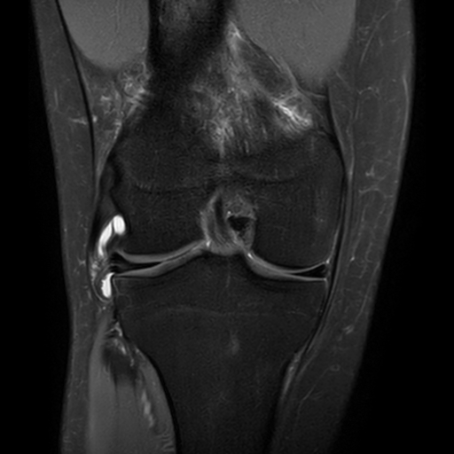
5. Displaying an image file
Text is great, but images rule (dude, you're a radiologist).
It is fairly easy to display images in a Jupyter notebook.
Double-click this cell to see the Markdown notation that was used to display a .PNG file of a knee MR that is located elsewhere on the internet:
If this image file were located in the same folder as this notebook file, one could use the following Markdown notation to display it:
6. Cells can contain Python code
By default, any new cells you create will expect raw Python code. If you enter valid Python commands in that cell and then hit shift-enter, Jupyter will run that code, and show the results in a result cell below that.
For example, the cell below tells the Python interpreter to add 2 and 3. Rendering that cell results in the output of 5.
2 + 3
If we import Python's math module, we can do more complex calculations:
import math
math.sqrt(45)
a = 5
b = 12
c = math.sqrt(a*a + b*b)
print("The hypoteneuse is equal to",c)
The following Python code does some basic text manipulation:
a = "bananas"
b = "kumquats"
print ("I want to eat some",a,"and some", b)
A brief caveat for Python cells
Many computer programs expect things to happen in a particular sequence. If one runs pieces of the program out of this sequence, the computer will get confused and throw up an error message.
For example, if we ask Python to evaluate "x + y" before we tell it the values of x and y, it will get confused.
The next two cells of Python code are out of order. If you evaluate them in the order they are presented below, Jupyter will show an error message.
x + y
x = 3
y = 5
The easiest way to fix this is by reversing their order in our notebook file. We can do this by cutting and pasting, using the appropriate icons in the toolbar. Another way to reverse them is by selecting one of the statements and then clicking on the up or down arrow in the toolbar to move that statement to a new location.
Also
Some of the exercises in this tutorial require loading a specific Python library. Therefore, when going through the examples in this notebook, be sure to start at the first step of each example, and to evaluate each of the cells in order.
7. Calculating a correlation coefficient
A common task in data analysis is estimating the Pearson product-moment correlation between two variables. Correlation coefficients are easy to calculate using numerical Python (numpy).
import numpy as np # load numpy

# now enter some x and y data
x = [10.0,8.0,13.0,9.0,11.0,14.0,6.0,4.0,12.0,7.0,5.0]
y =[8.04,6.95,7.58,8.81,8.33,9.96,7.24,4.26,10.84,4.82,5.68]

np.corrcoef(x,y) # calculate the correlation matrix
Ta dah!! The correlation coefficient for these two variables = 0.816 and change.
8. Creating a data plot
Now, let's plot the data we entered for x and y in the last example.
%matplotlib inline

import numpy as np # load numpy
import matplotlib.pyplot as plt

plt.scatter(x,y)

Next, let's do a linear regression of this data, and add a regression line to this scatterplot.
# linear regression of x and y where
# m is slope and b is y-intercept
m, b = np.polyfit(x, y,1)

# print out the regression coefficients
print ("slope =", m)
print ("y-intercept =", b)

# plot the data points
#plt.plot(x, y, '.')

plt.scatter(x,y)

# plot the regression line in red

plt.plot(x, m * np.array(x) + b,'r-')

9. Un-paired t-test of two populations
Another common task in data analysis is the t-test, in which we look for evidence that two sets of data have a statistically significantly different means.
The SciPy library has a number of useful open-source routines for mathematics, science, and engineering. This includes a variety of built-in statistical tests.
Let's start by importing the stats module:
from scipy import stats
Next, let's define some bogus data.
data1 = [1.83, 1.93, 1.88, 1.85, 1.85, 1.91, 1.91, 1.85, 1.78, 1.91, 1.93, 1.80, 1.80, 1.85, 1.93, 1.85, 1.83, 1.85, 1.91, 1.85, 1.91, 1.85, 1.80, 1.80, 1.85]
data2 = [1.96, 2.06, 2.03, 2.11, 1.88, 1.88, 2.08, 1.93, 2.03, 2.03, 2.03, 2.08, 2.03, 2.11, 1.93]
A good first step would be to visually inspect the data, perhaps with a histogram plot.
bins = np.linspace(1.7, 2.2, 30)

plt.hist(data1, bins, alpha=0.5, label='data1')
plt.hist(data2, bins, alpha=0.5, label='data2')
plt.legend(loc='upper right')
plt.show()

Another common method used to visually inspect data for trends is the boxplot. Let's see what that looks like for these two datasets:
data_to_boxplot = [data1, data2]

bp = plt.boxplot(data_to_boxplot)

So far, both of these two exploratory plots suggest that while there is some overlap between these two datasets, they look somewhat different.
It's time to quantify what our eyeballs have been suggesting to us. We can do this by running the SciPy independent t-test method:
stats.ttest_ind(data1, data2)
This gives us a t-statistic of 7.77, with a p-value of $2.3 \times 10^{-9}$, showing that our two datasets have means that are statistically significantly different.
For various reasons (e.g. if our data don't seem to be normally distributed), we might wish to test this difference with a different method; perhaps with a non-parametric test like the Kolmogorov-Smirnov 2-sample test. SciPy also has a method for that test:
stats.ks_2samp(data1, data2)
This gives us a t-statistic of 0.75, with a p-value of $1.94 \times 10^{-5}$, showing that it is highly likely that these two datasets come from two different distributions.
10. Interactive graphics
Jupyter has a cool module called ipywidgets that can add interactivity to ones graphics. Radioactive decay presents a nice demonstration of this interactivity.
%matplotlib inline

from ipywidgets import interactive, interact
from IPython.display import display
Now, let's use the equations for radioactive decay featured earlier in this notebook to create a custom decay function.
def decay_plot(halflife):
    N0 = 1000
    maxtime = 200
    x = np.arange(0,maxtime, 1)
    y = N0 * np.exp(-x*np.log(2)/halflife)

    plt.axis([0,200,0,1000])
    plt.plot(x,y)
    plt.ylabel("Number of atoms")
    plt.xlabel("time (min)")
    plt.title("Half-life = %s min" %halflife)
    plt.show()
Next, let's display an interactive plot. An interactive control bar for halflife will appear just above the plot. When this halflife control is adjusted, the decay plot will update in realtime.
w = interactive(decay_plot, halflife=(1,200,1))

display(w)
11. Mapping demonstration
Where did our radiology residents go to medical school?
It is occasionally useful to plot demographic or other geospatial data onto a map. Python and Jupyter can make a wide assortment of such maps.
This map demonstrates where our radiology residents went to medical school. This demonstration will download a short datafile exported from Excel in .csv (comma-separated variables) format. This file contains the name of the medical school attended by each of the radiology residents and the latitude and longitude for each of their medical schools. It then plots these sites on a map of the U.S. This map is then saved as a high quality (300 dpi) .TIF file.
# display inline on this page
%matplotlib inline

import csv
import urllib.request

# download an Excel file of data
url = 'http://uwmsk.org/jupyter/Resident_MS_data.csv'
filename, headers = urllib.request.urlretrieve(url)

# Create empty lists for the data we are interested in.
lats, lons = [], []
med_schools = []

# Read through the entire file, skip the first line,
#  and pull out just the name of the medical schools and their
#  latitudes and longitudes.

with open(filename) as f:
    # Create a csv reader object.
    reader = csv.reader(f)

    # Ignore the header row.
    next(reader)

    # Store the latitudes and longitudes in the appropriate lists.
    for row in reader:
        med_schools.append(row[0])
        lats.append(float(row[1]))
        lons.append(float(row[2]))


# Now it's time to make a map, using the Basemap library

from mpl_toolkits.basemap import Basemap
import matplotlib.pyplot as plt
import numpy as np

# make this plot nice and big
plt.figure(figsize=(16,12))

# Tell Basemap where to center the map and the lat/long of its margins.
# In this example we will use the Mercator projection centered over
#    the geographical center of the contiguous U.S.

res_map = Basemap(projection='merc', lat_0=39.8333333, lon_0=-98.585522,
    resolution = 'l', area_thresh = 1000.10,
    llcrnrlon=-125.5, llcrnrlat=23.5,
    urcrnrlon=-65.0, urcrnrlat=50.0)

# Draw the coastlines, national and state borders.
# Define the colors of the land and water on the map.

res_map.drawcoastlines()
res_map.drawcountries()
res_map.drawmapboundary(fill_color='aqua')
res_map.fillcontinents(color='wheat',lake_color='aqua')
res_map.drawstates()


# Plot a point for each resident
# and add a label nearby (25 km north and 25 km west of med school location)

marker_size = 10.0
for lon, lat, med_school in zip(lons, lats, med_schools):
    x,y = res_map(lon, lat)
    res_map.plot(x, y, 'go', markersize=marker_size)
    plt.text(x + 25000, y + 25000,  med_school)

# add a title to our map

title_string = "Medical schools attended by our radiology residents\n"

plt.title(title_string, fontsize=20)

# save a 300 dpi .TIF version of our map

plt.savefig('Resident_map.tif', dpi=300)

plt.show()

12. Creating and playing audio files
Radiologists use high frequency audio signals (ultrasound) to produce diagnostic images. In order to create and interpret sonographic images optimally, it is helpful to understand some of the underlying physics.
The sounds used in medical imaging have frequencies up in the range of 1 to 10 MHz. However, many ultrasonic phenomena can be modeled with sounds audible to humans. A Jupyter notebook makes it easy to produce custom sounds. This makes it easy to create and share interactive modules that the basic principles of diagnostic ultrasound.
Audio simulation 1: a simple sine wave tone generator
The intensity of a single pure audio tone is given by the following formula:
$$I = \sin{2 \pi f t}$$where t is time, and f is the frequency of the tone in Hz.
To create our tone, we will use the numpy (Numerical Python) library.
We will create a 1.5 second tone that is composed of a certain number of samples per second. For this example, we will use a sampling frequency of 44,100 Hz, which is the same sampling frequency used for compact discs. For this example, we will produce a 440 Hz tone, which is the A above middle C on a piano). One could use this tone to tune one's guitar or other instrument.
import numpy as np # load the Numerical Python library

fc = 440 # tone frequency --- A440
fs = 44100 # sampling frequency, Hz

T = 1.5 # length of tone in seconds
twopi = 2*np.pi

t = np.linspace(0, T, int(T*fs), endpoint=False) # time variable

output = np.sin(twopi*fc*t)
To play our tone, we will use the Python Audio library.
from IPython.display import Audio

Audio(output, rate=fs)
Audio simulation 2: Mixing two frequencies
Let's start with two pure audio sine waves. For this example, we have chosen two sounds with frequencies of 15 and 17 Hz. The following bit of Python code will plot these two waveforms for us:
# display inline on this page
%matplotlib inline

import matplotlib.pyplot as plt # load the Python plotting library

freq_1 = 15 #  frequency 1
freq_2 = 17 # frequency 2
fs = 3500 # sampling frequency, Hz

T = 3.0 # length of tone in seconds
twopi = 2*np.pi

t = np.linspace(0, T, int(T*fs), endpoint=False) # time variable

freq_1_output = np.sin(twopi*freq_1*t)
freq_2_output = np.sin(twopi*freq_2*t)

# now plot these two audio tones
f, axarr = plt.subplots(2, sharex=True)
axarr[0].plot(t, freq_1_output)
axarr[0].set_title('frequency = 15 Hz')
axarr[1].plot(t, freq_2_output)
axarr[1].set_title('frequency = 17 Hz')
axarr[1].set_xlabel('seconds')

Next, we will then mix two tones together. As these two tones go in and out of phase with each other, an interference pattern will be produced.
The next bit of Python code plots this interference pattern for us:
f1 = 15 #  frequency 1
f2 = 17 # frequency 2
fs = 44100 # sampling frequency, Hz

T = 3.0 # length of tone in seconds
twopi = 2*np.pi

t = np.linspace(0, T, int(T*fs), endpoint=False) # time variable

output = np.sin(twopi*f1*t) + np.sin(twopi*f2*t)


import matplotlib.pyplot as plt # load the Python plotting library

plt.figure(figsize=(15,6))
plt.plot(t, output)
plt.ylabel("Intensity")
plt.xlabel("time (sec)")
plt.title("Interference pattern of two tones")
plt.show()

# Audio(output, rate=fs)

At the beginning of the plot, the two sounds are in phase with each other, so they add together, producing a signal that is twice as big as eithe of the original signals. When the two sounds are out of phase with each other, they cancel each other out. The frequency of this interference pattern is equal to the difference in the two frequencies. Since we have chosen two frequencies that differ by ony 2 Hz, the interference pattern will occur twice per second.
The frequencies of these two sine waves were chosen to make it easy to see the details of the interference pattern. However, both of these frequencies are below the range of human hearing. Therefore, let's raise each frequency up into the audio range, but still keep the difference in the two frequencies equal to 2 Hz. For this example, we will use tones of 370 and 372 Hz.
Let's plot these and see how the mixture looks...
f1 = 370 #  frequency 1
f2 = 372 # frequency 2
fs = 44100 # sampling frequency, Hz

T = 3.0 # length of tone in seconds
twopi = 2*np.pi

t = np.linspace(0, T, int(T*fs), endpoint=False) # time variable

output = np.sin(twopi*f1*t) + np.sin(twopi*f2*t)

import matplotlib.pyplot as plt # load the Python plotting library

plt.figure(figsize=(15,6))
plt.plot(t, output)
plt.ylabel("Intensity")
plt.xlabel("time (sec)")
plt.title("Interference pattern of two tones")
plt.show()

The following code will mix these two tones together and let us hear listen to the mixture.
f1 = 370 #  frequency 1
f2 = 372 # frequency 2
fs = 44100 # sampling frequency, Hz

T = 3.0 # length of tone in seconds
twopi = 2*np.pi

t = np.linspace(0, T, int(T*fs), endpoint=False) # time variable

output = np.sin(twopi*f1*t) + np.sin(twopi*f2*t)

Audio(output, rate=fs)
Audio simulation 3: Doppler effect
If you have ever heard the shift in frequency of a train horn as it passes by at a railroad crossing, you have heard the Doppler effect in action.
The Doppler effect is used by policemen to nab speeding motorists, and by ultrasonographers to measure the speed and direction of flowing blood.
For an observer at rest, Doppler shift is expressed by the following equation:
$$f_{obs} = f_{orig} \times \frac{c}{c + V_{source}}$$where
| variable | meaning |
|---|---|
| $f_{orig}$ | original frequency |
| $f_{obs}$ | observed frequency |
| c | velocity of sound in medium |
| $V_{source}$ | speed of source |
Another factor determining Doppler shift is the radial velocity of the sound source. If a train is coming directly toward you, its radial velocity will be the same as its actual velocity. The frequency of the horn will stay the same until it hits you. As soon as it hits you and drives away over your mangled, headless body, its frequency will immediately drop down in pitch and stay the same as it recedes in the distance.
Fortunately, most of the time we are not struck by oncoming trains because we are safely off the tracks, waiting for it to pass by. In this instance, the radial velocity is related to the actual velocity by the following equation:
$$V_{radial} = V_{source} \times \cos{\theta}$$where $\theta$ is the angle between the source's forward velocity and the line of sight from the source to the observer.
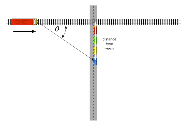
An oncoming train's horn will be higher in pitch than that of a train standing still. As the train gets closer to the listener, the pitch of the horn drops in pitch. At the moment the train hits the crossing, the pitch will be the same as a stationary train. As the train travels away from the crossing, its pitch drops further.
So, let's assume that we are stopped at a train crossing, and our blue car is 50 m back from the tracks. The simulation below assumes that the train will be approaching from the left at 27 m/sec (about 60 mph). We will also assume that the train's horn is a single 1000 Hz tone, and that the speed of sound in air is 340 m/sec.
The following Python code plots the frequencies we will hear as the train goes by:
vc = 1000.0 # original frequency in Hz

V = 340.0 # speed of sound in air in m/sec
# maxtime = 200

S = 27.0 # actual velocity in m/sec (60 mph = 27 m/sec)

dmax = 300.0 # width of observation window (m)

d = np.arange(-dmax/2, dmax/2, 1) #

b = 50.0 # distance from observer to tracks

SR = S * np.array(d)/np.sqrt(np.square(np.array(d)) + b*b)

#t = np.arange(dmax/S,-100, 1)
vo = vc * V/(V + np.array(SR))

#print(vo)

plt.figure(figsize=(9,6))
plt.axis([-150,150,800,1200])
plt.plot(d,vo)
plt.axhline(y=1000, xmin=-150, xmax=150, linewidth=1, linestyle='--', color = 'r')
plt.ylabel("Frequency (Hz)")
plt.xlabel("train position relative to crossing (m)")
plt.title("Doppler shift at {velocity:.0f} m/sec of {frequency:.0f} Hz train horn at {distance} meters from the tracks" .format(velocity = S, distance = b, frequency = vc))
plt.show()

Now, let's see what that sounds like. The following Python code will create an audio wavefore we can listen to:
# train horn frequency

f1 = 1000

fs = 44100 # sampling frequency, Hz

V = 340.0 # speed of sound in air in m/sec

S = 27.0 # train velocity in m/sec (60 mph = 27 m/sec)

dmax = 100.0 # width of observation window (m)

b = 50.0 # distance from observer to tracks at crossing

# transit time through our observation window
tt = dmax/S

T = 2.0 # length of tone in seconds
twopi = 2*np.pi

t = np.linspace(0, tt, int(tt*fs), endpoint=False) # time variable

#t = (d + tt/2)/S
# thus St = d + tt/2 --> d = St - dmax/2S

# d = distance of train from crossing
#    this is negative as the train approaches the crossing
#    and positive after it passes the crossing

d = S*np.array(t) - dmax/2

# SR = radial speed of train
#   add 0.00001 to b to prevent divide by 0 errors

SR = S*np.array(d)/np.sqrt(np.square(d) + (b+0.000001)*(b+0.000001))

# Doppler-shifted frequency component
f1d = f1 * V/(V + SR)

output = np.sin(twopi*np.multiply(f1d, t))


Audio(output, rate=fs)
However, this 1000 Hz tone sounds more like a slide whistle than an actual train horn. Let's try one more audio simulation and see if we can create a more convincing train sound.
Audio simulation 4: Amtrak Train horn with Doppler effect
Train horns are not single tones. Instead, they are chords, i.e. a combination of several different notes. Which specific notes? Our pal, the Internet, contains a number of excellent train hobbyist sites such as trainweb.org that give this information. The Uniqhorn site offers the following tidbit:
In 1976, Deane Ellsworth, who was working with Amtrak at the time, worked with Nathan to produce a new model of P horn. This horn became known as the P5a, with the 'a' for Amtrak tuning. The original P5 blew A7 (C# E G A C#), whereas the new P5a blew C# dim7 (C# E G A# C#).
So, which frequencies should we use to construct a C#dim7 chord? The Michigan Tech physics site has a handy table of note frequencies for a an equal-tempered scale. Here is the portion of the table for the octave above middle C:
| Note | Frequency (Hz) | Wavelength (cm) |
|---|---|---|
| C4 (middle C) | 261.63 | 131.87 |
| C#4/Db4 | 277.18 | 124.47 |
| D4 | 293.66 | 117.48 |
| D#4/Eb4 | 311.13 | 110.89 |
| E4 | 329.63 | 104.66 |
| F4 | 349.23 | 98.79 |
| F#4/Gb4 | 369.99 | 93.24 |
| G4 | 392.00 | 88.01 |
| G#4/Ab4 | 415.30 | 83.07 |
| A4 | 440.00 | 78.41 |
| A#4/Bb4 | 466.16 | 74.01 |
| B4 | 493.88 | 69.85 |
| C5 | 523.25 | 65.93 |
| C#5/Db5 | 554.37 | 62.23 |
The following Python code will pick the appropriate frequencies from this table and construct a C#dim7 chord.
from IPython.display import Audio

# Amtrak P5a tuning -- C#dim7

f1 = 277.18 # C#4
f2 = 329.63 # E4
f3 = 392.00 # G4
f4 = 466.16 # A#4
f5 = 554.37 # C#5

fs = 44100 # sampling frequency, Hz

T = 2.0 # length of tone in seconds
twopi = 2*np.pi

t = np.linspace(0, T, int(T*fs), endpoint=False) # time variable

output1 = np.sin(twopi*f1*t) +  np.sin(twopi*f2*t) + np.sin(twopi*f3*t) + np.sin(twopi*f4*t) + np.sin(twopi*f5*t)

Audio(output1, rate=fs)
This sounds a lot better. However, I played around with the relative intensities of the different frequency components. Personally, I find that boosting the higher frequency components a bit makes it sound a bit more realistic. Feel free to experiment with your own multipliers for the frequency components.
# boosting the higher frequency components makes the sound a bit more realistic, IMHO
output2 = np.sin(twopi*f1*t) +  2* np.sin(twopi*f2*t) + 4* np.sin(twopi*f3*t) + 4*np.sin(twopi*f4*t) + 4*np.sin(twopi*f5*t)

Audio(output2, rate=fs)
Doppler shift of Amtrak train with P5a horn
So, how would the Doppler shift look for all five notes of our chord?
# actual frequency components
f1 = 277.18 # C#4
f2 = 329.63 # E4
f3 = 392.00 # G4
f4 = 466.16 # A#4
f5 = 554.37 # C#5

V = 340.0 # speed of sound in air in m/sec
# maxtime = 200

S = 27.0 # actual velocity in m/sec (60 mph = 27 m/sec)

dmax = 300.0 # width of observation window (m)

d = np.arange(-dmax/2, dmax/2, 1) #

b = 50.0 # distance from observer to tracks

SR = S * np.array(d)/np.sqrt(np.square(np.array(d)) + b*b)

f1d = f1 * V/(V + SR)
f2d = f2 * V/(V + SR)
f3d = f3 * V/(V + SR)
f4d = f4 * V/(V + SR)
f5d = f5 * V/(V + SR)

#print each note of the chord

plt.figure(figsize=(9,6))
plt.axis([-150,150,200,650])
plt.plot(d,f1d)
plt.plot(d,f2d)
plt.plot(d,f3d)
plt.plot(d,f4d)
plt.plot(d,f5d)


plt.ylabel("Frequency (Hz)")
plt.xlabel("train position relative to crossing (m)")
plt.title("Doppler shift at {velocity:.0f} m/sec of P5a train horn at {distance} meters from the tracks" .format(velocity = S, distance = b, frequency = vc))
plt.show()

Final step: listen to the results
The final step is to listen to listent to our simulated train horn as it passes by our simulated train crossing.
# Amtrak P5a tuning -- C#dim7

# actual frequency components
f1 = 277.18 # C#4
f2 = 329.63 # E4
f3 = 392.00 # G4
f4 = 466.16 # A#4
f5 = 554.37 # C#5

fs = 44100 # sampling frequency, Hz

V = 340.0 # speed of sound in air in m/sec
# maxtime = 200

S = 27.0 # train velocity in m/sec (60 mph = 27 m/sec)

dmax = 100.0 # width of observation window (m)

b = 50.0 # distance from observer to tracks at crossing

# transit time through our observation window
tt = dmax/S

T = 2.0 # length of tone in seconds
twopi = 2*np.pi

t = np.linspace(0, tt, int(tt*fs), endpoint=False) # time variable

#t = (d + tt/2)/S
# thus St = d + tt/2 --> d = St - dmax/2S

# d = distance of train from crossing
#    this is negative as the train approaches the crossing
#    and positive after it passes the crossing

d = S*np.array(t) - dmax/2

# SR = radial speed of train
# add 0.00001 to b to prevent divide by 0 errors
SR = S*np.array(d)/np.sqrt(np.square(d) + (b+0.000001)*(b+0.000001))


# Doppler-shifted frequency components
f1d = f1 * V/(V + SR)
f2d = f2 * V/(V + SR)
f3d = f3 * V/(V + SR)
f4d = f4 * V/(V + SR)
f5d = f5 * V/(V + SR)

output = np.sin(twopi*np.multiply(f1d, t)) + 2*np.sin(twopi*np.multiply(f2d, t)) + 4*np.sin(twopi*np.multiply(f3d, t)) + 4*np.sin(twopi*np.multiply(f4d, t)) + 4*np.sin(twopi*np.multiply(f5d, t))


Audio(output, rate=fs)
13. Evaluating an imaging test with a zombie plot
One of the most important jobs of a radiologist is to pick the most appropriate imaging test for a particular clinical situation. Some tests suck and some are great. The zombie plot is tool that tries to make it easy to tell which tests are working well and which ones aren't.
A zombie plot is basically an ROC plot that has been divided into zones of mostly bad imaging efficacy (ZOMBIE) [Richardson]. If the confidence region (CR) for your test lies mostly in the mediocre or perverse zones, then it probably sucks.
[Richardson]: Richardson ML. The Zombie Plot: A Simple Graphic Method for Visualizing the Efficacy of a Diagnostic Test. AJR Am J Roentgenol. 2016 Aug 9:W1-W10. [Epub ahead of print] PMID: 27504811
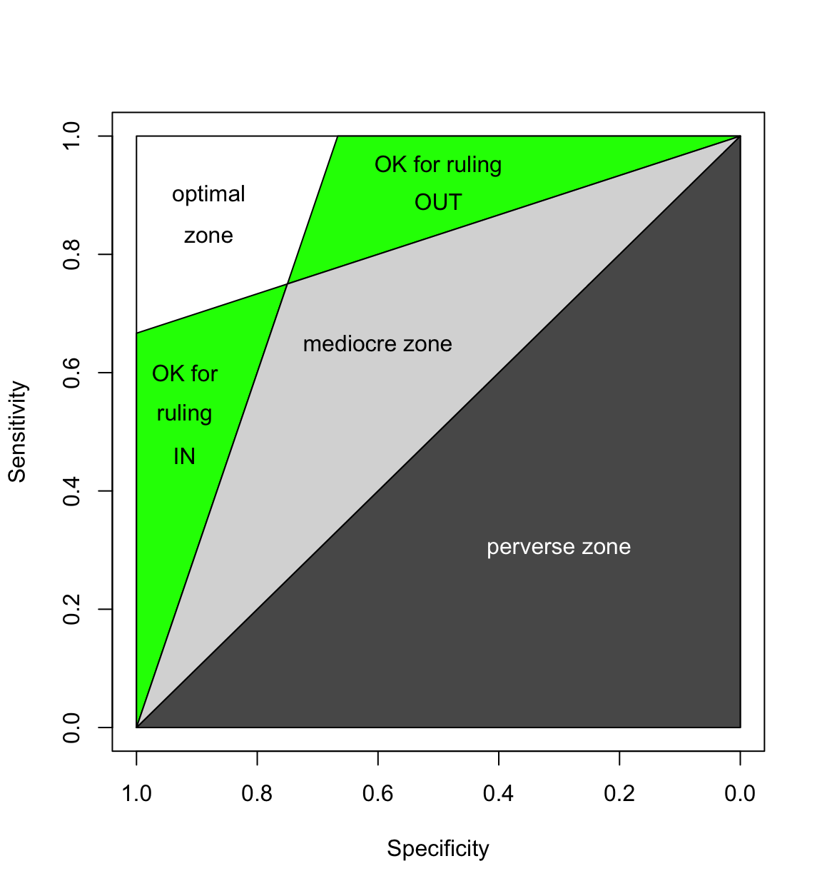
On the other hand, if the CR for your test lies mostly in the white or green zones, then it is probably a swell test.
One more thing: the closer the CR is to the upper left hand corner of the zombie plot and the smaller the CR, the better the test.
Several zombie plot calculators are available on the web. However, if you want to plot your own high-resolution zombie plot comparing the efficacy of several different tests, there's nothing like making your very own custom plot.
First, we will load in a few modules that Python will need to produce a zombie plot.
# load the modules we need

%matplotlib inline
import math
import sys
import numpy as np
import matplotlib.pyplot as plt
import matplotlib.patches as patches
Next, we will define a few handy custom functions that we will reuse endlessly.
We will start by defining a function that will calculate sensitivity and specificity and their 95% confidence intervals.
# function to calculate sensitivity and specificity and 95% CIs

def sens_spec(a,b,c,d):

    ab = a + b
    ac = a + c
    c_d = c + d
    bd = b + d
    abcd = a + b + c + d

    z = 1.96

    sens = float(a) / (float(a) + float(c))
    spec = float(d) / (float(b) + float(d))

    n = float(a) + float(c)

    p = sens
    q = 1 - sens
    sens_lo = (2 * n * p + z*z - 1 - z * math.sqrt(z*z - 2 - 1/n + 4 * p * (n * q + 1)))/(2 * (n + z*z))
    sens_hi = (2 * n * p + z*z + 1 + z * math.sqrt(z*z + 2 - 1/n + 4 * p * (n * q - 1)))/(2 * (n + z*z))

    if p == 0.0 :
        sens_lo = 0.0

    if p == 1.0 :
        sens_hi = 1.0

    n = float(b) + float(d)
    p = spec
    q = 1 - spec
    spec_lo = (2 * n * p + z*z - 1 - z * math.sqrt(z*z - 2 - 1/n + 4 * p * (n * q + 1)))/(2 * (n + z*z))
    spec_hi = (2 * n * p + z*z + 1 + z * math.sqrt(z*z + 2 - 1/n + 4 * p * (n * q - 1)))/(2 * (n + z*z))

    if p == 0.0:
        spec_lo = 0.0

    if p == 1.0:
        spec_hi = 1.0

    return sens, sens_lo, sens_hi, spec, spec_lo, spec_hi
Next, let's define a function that will plot an empty zombie plot frame.
# function to plot empty zombie plot frame

def plot_Zombie_Box(size):

    # set plot size in inches (width, height) & resolution (DPI)
    #fig1 = plt.figure(figsize = (size,size), dpi=100)
    plt.figure(figsize = (size,size), dpi=100)
    #ax1 = fig1.add_subplot(111, aspect='equal')

    # set aspect ratio to 'equal'
    plt.axes().set_aspect('equal')

    # set limits & labels for axes
    plt.xlim(1,0)
    plt.ylim(0, 1)

    plt.xlabel("Specificity", fontsize=15)
    plt.ylabel("Sensitivity", fontsize=15)


    # color examples from http://matplotlib.org/api/colors_api.html
    # plot perverse zone
    x = [1,0,0,1]
    y = [0,0,1,0]
    plt.fill(x,y,'0.35')

    # plot mediocre zone
    x = [1,0,0.75,1]
    y = [0,1,.75,0]
    plt.fill(x,y,'0.50')

    # plot OK to rule OUT zone
    x = [.75,0,.6666667,.75]
    y = [.75,1,1,.75]
    plt.fill(x,y,'0.80')

    # plot OK to rule IN zone
    x = [1,.75,1,1]
    y = [0,.75,.6666667,0]
    plt.fill(x,y,'0.80')
Finally, one more handy function that will plot a confidence region on the zombie plot frame.
# function to plot 95% CRs

def plot_Confidence_region(ss,  oval_color):
    sens = ss[0]
    sens_lo = ss[1]
    sens_hi = ss[2]

    spec = ss[3]
    spec_lo = ss[4]
    spec_hi = ss[5]

    plt.plot(spec, sens, marker="o", color= oval_color)

    # create an appropriate ellipse and add it to the figure

    ellipse1 = patches.Ellipse(((spec_hi + spec_lo)/2, (sens_hi + sens_lo)/2), (spec_hi - spec_lo), (sens_hi - sens_lo), facecolor=oval_color, alpha=.5)

    plt.gca().add_patch(ellipse1)
Functional vs conventional MR for soft-tissue sarcoma recurrence
Let's now point the zombie plot toward a concrete example. Del Grande et al [1] recently compared conventional MR sequences with two functional sequences for their ability to recognized soft-tissue recurrence.
- Del Grande F, Subhawong T, Weber K, Aro M, Mugera C, Fayad LM. Detection of Soft-Tissue Sarcoma Recurrence: Added Value of Functional MR Imaging Techniques at 3.0 T. Radiology. 2014 May;271(2):499–511.
The results of their study can be summarized by the following 2 x 2 contingency tables:
Conventional
| Reference (+) | Reference (-) | total | |
|---|---|---|---|
| Test (+) | 6 | 15 | 21 |
| Test (-) | 0 | 16 | 16 |
| total | 6 | 31 | 37 |
Conventional + DCE
| Reference (+) | Reference (-) | total | |
|---|---|---|---|
| Test (+) | 6 | 1 | 7 |
| Test (-) | 0 | 30 | 30 |
| total | 6 | 31 | 37 |
Conventional + DW with ADC mapping
| Reference (+) | Reference (-) | total | |
|---|---|---|---|
| Test (+) | 3 | 1 | 4 |
| Test (-) | 2 | 30 | 32 |
| total | 5 | 31 | 36 |
Let's start by comparing conventional MR sequences with dynamic contrast enhancement.
plot_Zombie_Box(10)

plt.title(u'Del Grande \u2014 Functional MR of ST Tumors', fontsize=20)

# Conventional
ss = sens_spec(6,15,0,16)
color = "red"
plot_Confidence_region(ss, color)
plt.annotate(u'conventional', (.62,.7), fontsize=19, color="white")

# complete -- MRA
ss = sens_spec(6,1,0,30)
color = "green"
plot_Confidence_region(ss, color)
plt.annotate(u'with DCE', (.985,.75), fontsize=19, color="white")


plt.savefig('Del_Grande_conventional_vs_DCE.png', dpi=300)

plt.show()

This plot shows that the confidence region (CR) for conventional MR sequences is largely located in the mediocre zone of the zombie plot --- not too compelling. However, much of the CR for DCE is located within the optimal zone, and all of it is located within the adequate zone for ruling in disease. This suggests that DCE does a pretty good job of demonstrating soft tissue tumor recurrence --- a much better job than conventional sequences.
Conventional + DW with ADC mapping
Finally, let's compare conventional MR sequences with the following data for diffusion-weighted images with ADC mapping:
| Reference (+) | Reference (-) | total | |
|---|---|---|---|
| Test (+) | 3 | 1 | 4 |
| Test (-) | 2 | 30 | 32 |
| total | 5 | 31 | 36 |
plot_Zombie_Box(10)

plt.title(u'Del Grande \u2014 Functional MR of ST Tumors', fontsize=20)

# Conventional
ss = sens_spec(6,15,0,16)
color = "red"
plot_Confidence_region(ss, color)
plt.annotate(u'conventional', (.62,.7), fontsize=19, color="white")

# complete -- MRA
ss = sens_spec(3,1,2,30)
color = "green"
plot_Confidence_region(ss, color)
plt.annotate(u'DW + ADC', (.992,.55), fontsize=17, color="white")


plt.savefig('Del_Grande_conventional_vs_DW_ADC.png', dpi=300)

plt.show()

Again, the confidence region (CR) for conventional MR sequences is largely located in the mediocre zone of the zombie plot. Much of the CR for DW + ADC is located within the optimal zone, and almost all of it is located within the adequate zone for ruling in disease. This suggests that DW + ADC also does a pretty good job of ruling in soft tissue tumor recurrence, and a much better job than conventional MR sequences.