Jupyter Interactive Widgets for Teaching Radiology Physics
To view these modules, please sequentially select each cell, and hit shift-enter.
The next cell below loads some important Python modules that will do the heavy lifting in this notebook.
# this following line tells Jupyter to display images here in the browser,
# rather than in separate window.

%matplotlib inline

# import matplotlib and numpy
import matplotlib.pyplot as plt
import numpy as np

from ipywidgets import interactive, interact, Label, widgets, Layout, Button, Box, HBox, VBox
from IPython.display import display
from IPython.display import Audio
Nuclear Medicine
1. Nuclear medicine: Simple radioactive decay
When a parent radionuclide decays to a daughter radionuclide, the decay follows an exponential form, as shown in this equation:
$$A(t) = A_{0} e^{-\lambda t}$$
where $A_{0}$ is the initial activity, $t$ is time, and $\lambda$ is the decay constant $-$ the probability that a radioatom will decay per unit time [Groch, 1998]. This decay constant is related to the isotope's half-life ($t_{\frac{1}{2}}$) $-$ the time when 50\% of the radioatoms present will have decayed $-$ as shown in this equation:
$$t_{\frac{1}{2}} = \frac{ln(2)}{\lambda}$$
Half-life has direct implications in nuclear medicine imaging, radiation therapy and radiation safety. For example, the half-life can make it relatively simple to calculate how much of a radioisotope will be left after a given time. For example, $^{99m}$technetium has a half-life of about 6 hours. Therefore, after 24 hours, the remaining amount of $^{99m}$Tc will be 1/2 x 1/2 x 1/2 x 1/2 or 1/16 of the original amount.
We used the decay equation to write an interactive teaching widget in Jupyter. In this simple widget, one can vary the half-life using a control slider and immediately see the effect on the decay curve.
First, we define a decay function:
def decay_plot(halflife):
    #Function that takes halflife as an input and displays a graph

    # Set the baseline number of activity. 1000 is a nice round number
    A0 = 1000
    # Set the maximum on the x-axis
    maxtime = 200

    #calculate decay constant
    lam=np.log(2)/halflife

    # Generate the x and y points for the decay curve
    x = np.arange(0,maxtime, 1)
    y = A0 * np.exp(-x*lam)

    # Generate the x and y points for the half life horizontal and vertical lines
    x1 = np.arange(0,halflife, 1)
    y1 = x1*0+(A0/2)
    y2 = np.arange(0,A0/2, 1)
    x2 = y2*0+halflife

    # Plot the results
    plt.axis([0,200,0,1000])
    plt.plot(x,y)
    plt.plot(x1,y1,color="green")
    plt.plot(x2,y2,color="green")
    plt.ylabel("Number of atoms")
    plt.xlabel("Time (min)")
    plt.title("Half-life = %s min" %halflife)
    plt.show()
Next, let's create an interactive widget that calls this decay function.
w1 = interactive(decay_plot, halflife=(1,200,1))

display(w1)
2. Nuclear medicine: Technetium generator
One of the more common radioisotopes used in nuclear medicine is the metastable isotope $^{99m}$technetium ($^{99m}$Tc).
$^{99m}$Tc has a half-life of only 6 hours, which is very convenient for many diagnostic procedures. However, it is very inconvenient to transport short half-life isotopes.
Fortunately, an isotope of molybdenum ($^{99}$Mo) has a much longer half-life (66 hours), and decays to $^{99m}$Tc, which in turn decays to $^{99m}$Tc (half-life = 211,000 years). The relatively long half-life of $^{99}$Mo makes it much more convenient for transport from the reactor where it is made to the nuclear medicine department where it will be used clinically. The decay scheme for $^{99}$Mo is shown in this equation:
$${^{99}Mo} \xrightarrow{\lambda_A} {^{99m}Tc} \xrightarrow{\lambda_B} {^{99}Tc}$$
This decay chain is the basis for the technetium generators (aka moly cows) used in clinical nuclear medicine.

In general, the decay of the simple three-isotope chain shown in the following equation:
$$parent \xrightarrow{\lambda_A} daughter \xrightarrow{\lambda_B} granddaughter$$
can be expressed by the Bateman equation [Groch, 1998]:
$${parent}= \frac{ \lambda_{daughter}}{\lambda_{daughter}-\lambda_{parent}}A_{parent(0)}( e^{- \lambda_{parent} \cdot t} - e^{- \lambda_{daughter} \cdot t} )$$
In this version of the Bateman equation, $\lambda = \frac{ln(2)}{t_{\frac{1}{2}}}$.
We have created an interactive widget that allows the student to control the half-lives of the parent and daughter isotopes and immediately view the relative activity curves of the two isotopes.
Let's start by defining a new decay function for our isotope decay chain.
def decay_chain(halflife_parent, halflife_daughter):
    # set initial activity of isotopes in decay chain
    N_parent_0 = 1000
    N_daughter_0 = 0

    maxtime = 240
    x = np.arange(0,maxtime, 1)
    A_parent = N_parent_0 * np.exp(-x*np.log(2)/halflife_parent)

    bateman_1 = (np.log(2)/halflife_daughter)/((np.log(2)/halflife_daughter) - (np.log(2)/halflife_parent))
    bateman_2 = (np.exp(-x*np.log(2)/halflife_parent) - np.exp(-x*np.log(2)/halflife_daughter))

    A_daughter = N_parent_0 * bateman_1 * bateman_2 + N_daughter_0*np.exp(-x*np.log(2)/halflife_daughter)

    plt.axis([0,240,0,1000])
    plt.plot(x,A_parent, '-b', label='parent')
    plt.plot(x,A_daughter, 'r--', label='daughter')
    plt.legend()
    plt.ylabel("Relative activity")
    plt.xlabel("Time (hours)")
    #plt.title("Half-life = %s hours" %halflife_Mo)
    plt.title("Parent / daughter isotope activity")
    plt.show()
Next, let's define an interactive widget that will let us play with different half-lives for the parent and daughter isotopes.
w2 = interactive(decay_chain,
                 halflife_parent=widgets.IntSlider(min=1,max=200,value=66),
                 halflife_daughter=widgets.IntSlider(min=1,max=200,value=6)
                )

display(w2)
This widget allows a student to easily explore the state of equilibrium between two isotopes. There are two types of radioactive equilibrium: secular and transient [Groch, 1998].
Secular equilibrium: Secular (permanent) equilibrium occurs when the half-life of the parent is much, much longer than the half-life of the daughter. As the parent gradually decays to the daughter radionuclide, the amount of the daughter activity rises in an exponential but asymptotic manner until it reaches approximately the same activity of the parent. This results in production of a constant supply of daughter radionuclide over a long period.
Transient equilibrium: In transient equilibrium, the half-life of the parent is somewhat longer than that of the daughter. Once transient equilibrium is reached, the daughter activity can be slightly higher than that of the parent, and the daughter will from then on seem to decay with the apparent half-life of the parent. The transient equilibrium between $^{99}$Mo and $^{99m}$Tc is used as the basis for the radioisotope generators used to produce $^{99m}$Tc for clinical nuclear medicine imaging.
Ultrasound
3. Ultrasound: Interference of two sound waves
Radiologists use ultrasound transducers to create clinically useful images of anatomy and pathology. Pulses of high frequency sound waves are sent into the body by the sonographic transducer, and images are created from the returning echos. Sound waves traveling through the transducer and the body can superimpose with each other to form various patterns. This phenomenon is known as interference. When two waves superimpose, the resulting interference pattern may be a wave of greater, lower or the same amplitude, depending on the amplitude and phase of the two initial waves.
This principle of superimposition of waves has many practical uses in diagnostic ultrasound. It can be used to create a phased-array ultrasound transducer, which allows real-time two-dimensional imaging. The interference properties of a transducer can also be adjusted to create different focal zones to optimize imaging of structures at different depths within the body.
An easy way to begin the study of sound interference patterns is to see what happens when two sounds of different frequencies are blended together.
If we were to mix a 15 Hz sound with a 17 Hz sound, we would see an interference pattern such as the one in the next figure.
# code to plot the superimposition of a 15 Hz and a 17 Hz sound

f1 = 15 #  frequency 1
f2 = 17 # frequency 2
fs = 44100 # sampling frequency, Hz

T = 3.0 # length of tone in seconds
twopi = 2*np.pi

t = np.linspace(0, T, int(T*fs), endpoint=False) # time variable

output = np.sin(twopi*f1*t) + np.sin(twopi*f2*t)


import matplotlib.pyplot as plt # load the Python plotting library

plt.figure(figsize=(15,6))
plt.plot(t, output)
plt.ylabel("Intensity")
plt.xlabel("time (sec)")
plt.title("Interference pattern of two tones")
plt.show()

We can see from the outline of the waveform in the previous plot that there are peaks and troughs occurring twice a second. This new frequency is sometimes called the beat frequency, and is equal to the difference of the two original frequencies.
Interference patterns with frequencies this low are easy to visualize. However, they are too low for the human ear to hear. For our next example, we will therefore crank the frequency well up into human range.
We will creat an interactive widget that allows a student to interactively vary the frequencies of two sound waves (between 125 and 600 Hz) and to see and hear the resulting interference patterns.
We will start by defining an interference function:
def interference_audio(frequency_1, frequency_2):
    fs = 44100 # sampling frequency, Hz

    T = 3.0 # length of tone in seconds
    twopi = 2*np.pi

    t = np.linspace(0, T, int(T*fs), endpoint=False) # time variable

    output = np.sin(twopi*frequency_1*t) + np.sin(twopi*frequency_2*t)

    plt.figure(figsize=(15,6))
    plt.plot(t, output)
    plt.ylabel("Intensity")
    plt.xlabel("Time (sec)")
    plt.title("Interference pattern of two tones")
    plt.show()

    display(Audio(data=output, rate=fs))

    return output
We will now create a widget that calls this interference function. Changing the seetings of the frequency sliders will automatically display the new interference pattern. One can then click the play button to hear what this sounds like.
w3 = interactive(interference_audio,
                 frequency_1=widgets.IntSlider(min=125,max=600,value=200),
                 frequency_2=widgets.IntSlider(min=125,max=600,value=203)
                )

display(w3)
Module 4. Ultrasound: Doppler effect
The Doppler effect is used by policemen to nab speeding motorists, and by medial ultrasonographers to measure the speed and direction of flowing blood.
If you have ever heard the shift in frequency of a train horn as it passes by at a railroad crossing, you have heard the Doppler effect in action.
For an observer at rest, Doppler shift is expressed by this equation:
$$f_{obs} = f_{orig} \times \frac{c}{c + V_{source}}$$
where $f_{orig}$ is the original frequency, $f_{obs}$ is the observed frequency, c is the velocity of sound in a medium and $V_{source}$ is the speed of the source.
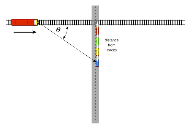
Another factor determining Doppler shift is the radial velocity of the sound source radial velocity of the sound source. To an observer standing directly the tracks, the radial velocity of the train would be the same as its actual velocity. The frequency of the train horn would therefore stay the same until it reached the observer. As the train passed over the observer, its frequency would immediately drop down in pitch and stay the same as it receded in the distance.
Fortunately, most observers do not stand on the tracks in front of oncoming trains, and are watching from a safe distance. For these observers, the radial velocity is related to the actual velocity by this equation:
$$V_{radial} = V_{source} \times \cos{\theta}$$
where $\theta$ is the angle between the source's forward direction of travel and the line of sight from the source to the observer.
An oncoming train's horn will be higher in pitch than that of a train standing still. As the train gets closer to the listener, the pitch of the horn drops in pitch. At the moment the train hits the crossing, the pitch will be the same as that of a stationary train. As the train travels away from the crossing, its pitch drops further.
This would be a good time to point out that train horns are not single tones. Instead, they are chords, i.e. a combination of several different notes. Which specific notes? Our pal, the Internet, contains a number of excellent train hobbyist sites such as trainweb.org that give this information. The Uniqhorn site offers the following tidbit:
In 1976, Deane Ellsworth, who was working with Amtrak at the time, worked with Nathan to produce a new model of P horn. This horn became known as the P5a, with the 'a' for Amtrak tuning. The original P5 blew A7 (C# E G A C#), whereas the new P5a blew C# dim7 (C# E G A# C#).
We will now use the equations above to plot this change in pitch as the train goes by.
# actual frequency components
f1 = 277.18 # C#4
f2 = 329.63 # E4
f3 = 392.00 # G4
f4 = 466.16 # A#4
f5 = 554.37 # C#5

V = 340.0 # speed of sound in air in m/sec
# maxtime = 200

S = 27.0 # actual velocity in m/sec (60 mph = 27 m/sec)

dmax = 300.0 # width of observation window (m)

d = np.arange(-dmax/2, dmax/2, 1) #

b = 50.0 # distance from observer to tracks

SR = S * np.array(d)/np.sqrt(np.square(np.array(d)) + b*b)

f1d = f1 * V/(V + SR)
f2d = f2 * V/(V + SR)
f3d = f3 * V/(V + SR)
f4d = f4 * V/(V + SR)
f5d = f5 * V/(V + SR)

#print each note of the chord

plt.figure(figsize=(9,6))
plt.axis([-150,150,200,650])
plt.plot(d,f1d)
plt.plot(d,f2d)
plt.plot(d,f3d)
plt.plot(d,f4d)
plt.plot(d,f5d)


plt.ylabel("Frequency (Hz)")
plt.xlabel("train position relative to crossing (m)")
plt.title("Doppler shift of an Amtrak P5a train horn")
plt.show()

This plot shows the Doppler shift of each of the frequency components of an Amtrak P5a horn as a function of the train's position relative to a crossing. Each component is plotted in a different color. For purposes of this plot, the train is traveling from left to right at 27 m/sec, and the observer is located 50 meters away from the tracks.
Now, let's create an interactive module that will let us hear how this sounds. By moving the slider, one will be able to see how the sound varies with the observer's distance from the tracks.
It is particularly interesting to hear the sound of the train when the distance is zero.
def Doppler(distance_from_tracks):
    f1 = 277.18 # C#4
    f2 = 329.63 # E4
    f3 = 392.00 # G4
    f4 = 466.16 # A#4
    f5 = 554.37 # C#5

    fs = 44100 # sampling frequency, Hz

    V = 340.0 # speed of sound in air in m/sec

    S = 27.0 # train velocity in m/sec (60 mph = 27 m/sec)

    dmax = 100.0 # width of observation window (m)

    b = distance_from_tracks

    # transit time through our observation window
    tt = dmax/S

    T = 2.0 # length of tone in seconds
    twopi = 2*np.pi

    t = np.linspace(0, tt, int(tt*fs), endpoint=False) # time variable

    #t = (d + tt/2)/S
    # thus St = d + tt/2 --> d = St - dmax/2S

    # d = distance of train from crossing
    #    this is negative as the train approaches the crossing
    #    and positive after it passes the crossing

    d = S*np.array(t) - dmax/2

    # SR = radial speed of train
    # add 0.00001 to b to prevent divide by 0 errors
    SR = S*np.array(d)/np.sqrt(np.square(d) + (b+0.000001)*(b+0.000001))


    # Doppler-shifted frequency components
    f1d = f1 * V/(V + SR)
    f2d = f2 * V/(V + SR)
    f3d = f3 * V/(V + SR)
    f4d = f4 * V/(V + SR)
    f5d = f5 * V/(V + SR)

    output = np.sin(twopi*np.multiply(f1d, t)) + 2*np.sin(twopi*np.multiply(f2d, t)) + 4*np.sin(twopi*np.multiply(f3d, t)) + 4*np.sin(twopi*np.multiply(f4d, t)) + 4*np.sin(twopi*np.multiply(f5d, t))

    display(Audio(data=output, rate=fs))

    return output
w4 = interactive(Doppler, distance_from_tracks=(0,100,1))

display(w4)
MR
Module 5. MR: T2 vs T2*
T2 is the time constant for the decay of transverse magnetization arising from natural interactions at the atomic or molecular levels. It measures contributions to the transverse decay of the MR signal that arise from natural interactions at the atomic and molecular levels within the tissue or substance of interest (MRI-Q.com).
T2 decay in the $xy$ plane is a function of time $(t)$, as shown by this equation:
$$M_{xy}(t) = M_{0} e^{\frac{-t}{T2}}$$
Next, we will create a plot showing this decay curve. We will arbitrarily choose T2 to be 30 msec for purposes of this plot.
T2 = 30
time = np.arange(1,160, 1)
Mxy = np.exp(-time/T2)

plt.figure(figsize = (6,4), dpi=100)
plt.axis([0,160,0,1.0])
plt.plot(time, Mxy)
plt.ylabel("Transverse magnetization")
plt.xlabel("time (msec)")
plt.title("Transverse magnetization decay ($T2 = 30 msec$)")
plt.show()

In any real NMR experiment, however, the transverse magnetization decays much faster than would be predicted by natural atomic and molecular mechanisms; this rate is denoted T2* ("T2-star"). T2* can be considered an "observed" or "effective" T2, whereas plain, vanilla T2 can be considered the "natural" or "true" T2 of the tissue being imaged. T2* is always less than or equal to T2.
$$ \frac{1}{{T2}^{*}} = \frac{1}{T2} + \frac{1}{{T2}_{i}}$$
where $\frac{1}{{T2}_{i}} = \gamma \Delta B_{i}$ is the relaxation rate contribution attributable to field inhomogeneities ($\Delta B_{i}$) across a voxel.
In spin-echo imaging, the second RF pulse rephases only those spins whose local magnetic field does not change in the interval between RF excitation and echo formation. In other words, the field inhomogeneities that lead to major differences between T2 and T2* are corrected by the rephasing pulse. Thus, image contrast is dictated by true T2-relaxation.
However, with gradient-echo imaging, the phase shifts resulting from magnetic field inhomogeneities, static tissue susceptibility gradients, or chemical shifts are not cancelled at the center of the GRE as they are in SE sequences. Image contrast is therefore dictated not by true T2-relaxation, but by these other factors which constitute T2*.
Let's use an interactive widget to see how T2* changes as a result of the percent change in the relative field inhomogeneity.
from ipywidgets import FloatSlider, Label, IntSlider

def delta_Bi(dBi):

    T2 = np.arange(1,400, 1)
    T2_star = 1/((1/T2) + (dBi/100))

    plt.figure(figsize = (6,6), dpi=100)
    plt.axis([0,200,0,200])
    plt.plot(T2, T2_star)
    plt.ylabel("T2* (observed T2) (msec)")
    plt.xlabel("Actual T2 (msec)")
    plt.title("T2* vs. T2 for % change in relative homogeneity")
    plt.gca().set_aspect('equal')
    plt.show()
t2plot_2 = interactive(delta_Bi,
                       dBi = widgets.FloatSlider(min=.01,max=10.0,step=.01,description=r'\(\Delta B_{i}\)'),
                       )
widgets.FloatSlider(readout_format='+f')
Label(value=r'\(\deltaB_{i}\)')
display(t2plot_2)
Module 6. MR: Magic angle effects on a simulated tendon
In pulse sequences with a moderate or short TE, the signal intensity of tendons, ligaments, and menisci depends on their orientation to the constant magnetic induction field $B_{0}$ (Chappell et al).
These highly ordered, collagen-rich tissues contain water that is bound to collagen. The protons within this water display dipolar interactions whose strength depends on the orientation of the fibers to $B_{0}$. These interactions usually result in rapid dephasing of the MR signal after excitation and a very short T2. As a consequence, these tissues typically produce little or no detectable signal intensity and appear dark when imaged with conventional clinical MR pulse sequences.
The dipolar interactions are modulated by the term $3cos^{2}\theta - 1$, where $\theta$ is the angle the structures make with the static field $B_{0}$. When $3cos^{2}\theta - 1 = 0$ (55°,125°, etc. approximately, the magic angle), dipolar interactions are minimized with the result that the T2 relaxation times of these tissues are increased and signal intensity may become evident within them when they are imaged with conventional pulse sequences. This increase in signal intensity usually occurs when all or part of a tendon or ligament happens to be at 55° to $B_{0}$. It has been recognized as an artifact and potential source of error in musculoskeletal MR imaging. The effect has also been exploited as an imaging technique by deliberately placing tendons at the magic angle to obtain signal intensity from them and demonstrate changes in disease, as well as contrast enhancement.
The code below simulates the magic angle effect in a simulated ankle tendon as it curves around behind one of the malleoli. By changing the sliders, one can vary TE imaging parameter and tissue T2, and immediately see how this affects signal in the tendon.
%matplotlib inline

import matplotlib.pyplot as plt
import numpy as np
from matplotlib.patches import Wedge
from ipywidgets import interactive, interact, Label, widgets, Layout, Button, Box
from IPython.display import display

def X_magic(TE, T2base):

    # set up a nice wide figure to contain both plots
    fig = plt.figure(figsize=(10,5))

    # set up parameters for plot of signal intensity vs angle
    rad2deg = 2 * np.pi /360
    #T2base = 10.0
    alpha = .03
    S1 = 5.0
    S0 = 5
    #TE = 22

    theta1 = np.arange(0,90, 2)
    T2_magic_angle = (1/T2base) + (1/(alpha*(3*np.cos(rad2deg*theta1)* np.cos(rad2deg*theta1) - 1)**2))

    S_magic_angle = S1 + S0 * np.exp(-TE / T2_magic_angle)

    # plot signal intensity vs theta in first subplot area
    ax = fig.add_subplot(121)

    plt.axis([0,90,0,20])
    plt.plot(theta1, S_magic_angle)
    plt.ylabel("Signal Intensity (arbitrary units)")
    plt.xlabel("Angle to $B_{0}$ field")
    plt.title("Signal Intensity vs angle to $B_{0}$")

    # create tendon gray scale map scaled on min and max signal intensity
    tendon_map =  np.round((S_magic_angle - np.ndarray.min(S_magic_angle))/(np.ndarray.max(S_magic_angle) - np.ndarray.min(S_magic_angle)), 2)

    #print(np.array_str(tendon_map))
    #print(range(len(theta)-1))

    # create second subplot area for the simulated tendon
    ax2 = fig.add_subplot(122, frameon=False)

    theta2 = np.linspace(180, 270, 45)

    for i in range(len(theta2)-1):
    #    print(np.array_str(tendon_map[i]))
        ax2.add_artist(
            Wedge((0, 0), 1, theta2[i], theta2[i+1], width=0.2, color=np.array_str(tendon_map[i]))
    )

    ax2.set_xlim((-1.25,.25))
    ax2.set_ylim((-1.25,.25))
    ax2.axes.get_xaxis().set_visible(False)
    ax2.axes.get_yaxis().set_visible(False)

    ax2.annotate("$B_{0}$",
            xy=(-.3, 0.1), xycoords='data',
            xytext=(-.37, -0.12), textcoords='data',fontsize=19,
            arrowprops=dict(arrowstyle="simple",
                            connectionstyle="arc3"),
            )

    plt.show()
magic_angle_plot = interactive(X_magic,
                               TE = IntSlider(value=60, description='TE', max=120, min=1),
                               T2base = IntSlider(value=100, description='Tissue T2', max=200, min=1),
                               Bzero=FloatSlider(value=1.5, description='Magnetic Field Strength', max=7.0, min=0.1, step=0.1)
                              )

display(magic_angle_plot)
Module 7. MR: Contrast optimzation
Tumor imaging protocols are designed to optimize the contrast between tumor and background normal tissue.
For double spin-echo imaging, signal intensity of a tissue can be expressed as a following function of several variables:
$$Intensity = H \cdot e^{\frac{-TE}{T2}} (1 - 2 e^{\frac{-(TR - 3 \tau)}{T1}} + 2 e^{\frac{-(TR - \tau)}{T1}} - e^{\frac{-TR}{T1}}) $$
| variable | interpretation |
|---|---|
| H | local hydrogen density |
| T1 | longitudinal magnetic relaxation constant |
| T2 | transverse magnetic relaxation constant |
| TR | pulse repetition time |
| TE | echo delay |
| $\tau$ | time between the first 90° RF pulse and the first 180° RF pulse in the spin-echo pulse train |
A simple definition of MR contrast would simply be the difference in signal intensity between tumor and the background tissue:
$$ contrast = {Intensity}_{tumor} - {Intensity}_{background} $$
Richardson et al measured H, T1 and T2 values for several tumor types, as well as normal muscle, normal fat and normal bone marrow (Richardson et al).
| Tissue | H | T1 (msec) | T2 (msec) |
|---|---|---|---|
| normal fat | 1170--1580 | 214--242 | 46 --58 |
| normal marrow | 1280--1410 | 210--246 | 51--60 |
| normal muscle | 1000 | 456--520 | 28--40 |
| fibrosarcoma | 1180 | 991 | 71 |
| giant cell tumor | 950 | 965 | 68 |
| osteogenic sarcoma | 1360-1990 | 991--1213 | 58--62 |
Therefore, using these values of H, T1 and T2 for two tissues, one could use these formulas to calculate the contrast between these tissues for a many potential values of TR, TE and $\tau$ ($\tau$ = 14 msec in Richardson's paper).
First, let's define a function to calculate the contrast between two tissues, given H, T1 and T2 for both tissues:
def MR_contrast_SE(H_1, T1_1, T2_1, H_2, T1_2, T2_2, TR, TE):

    tau = 14

    I_1 = H_1 * np.exp(-TE/T2_1)*(1 - 2 * np.exp(-(TR - 3*tau)/T1_1) + 2 * np.exp(-(TR - tau)/T1_1 - np.exp(-TR/T1_1)))

    I_2 = H_2 * np.exp(-TE/T2_2)*(1 - 2 * np.exp(-(TR - 3*tau)/T1_2) + 2 * np.exp(-(TR - tau)/T1_2 - np.exp(-TR/T1_2)))

    contrast = I_1 - I_2

    return contrast
Next let's define a function that will create a contour plot of contrast, as a function of many potential values of TR and TE:
def Tumor_contour_SE(Tumor_H,Tumor_T1,Tumor_T2,Tissue_H,Tissue_T1,Tissue_T2):

    tau = 14

    delta = 10
    x = np.arange(0,5000, delta)
    y = np.arange(0,200, delta)
    TR, TE = np.meshgrid(x, y)


    Z = MR_contrast_SE(Tumor_H,Tumor_T1,Tumor_T2,Tissue_H,Tissue_T1,Tissue_T2, TR, TE)


    # Create a simple contour plot with labels
    plt.figure()
    CS = plt.contour(TR, TE, Z, 15, colors='k')
    plt.clabel(CS, inline=1,fmt='%1.0f', fontsize=10)
    plt.ylabel("TE (msec)")
    plt.xlabel("TR (msec)")
    plt.title('Spin-echo contrast: Tumor vs. normal tissue')
    plt.show()
Finally, we will define an interactive widget that will allow us to vary the tissue parameters and see in real-time how those changes affect contrast between our two tissues. In this plot, positive contours represent areas where the tumor is brighter than the background tissue. Negative contours represent areas where the tumor is darker than the background tissue.
w5 = interactive(Tumor_contour_SE, Tumor_H = (900,2000,10),Tumor_T1=(200,1400,10),Tumor_T2=(20,100,5),Tissue_H=(900,2000,10),Tissue_T1=(200,900,10),Tissue_T2=(20,100,5))

display(w5)
One can model contrast for other MR pulse sequences by using the appropriate equation for signal intensity and adding parameters as needed.